UX Case Study:
Bumble BFF Groups
Context
Making friends as an adult is hard. The COVID-19 pandemic, remote work and less opportunities to meet face-to-face, accelerated the trend of turning to the internet for seeking company.
Bumble BFF
Over 40 digital products offer help with finding friends online. Some focus on local community/neighbors, others on niche interests; some offer online interaction as the final goal, yet others see it as a step towards the face to face meeting. Bumble BFF is seeking to replicate the success of its dating mode by using similar matching algorithm and swiping right to explore potential friendship.
Project background
Goal: Evaluate effectiveness of the existing Bumble app’s BFF mode. Design feature aimed at improving the user experience with the app.
Time frame: 10 days
Toolkit: Sketching, Google Workspace, Figma & FigJam, Canva, Xtensio, Skype, Zoom, Otter.Ai
Team: 3 UX fellows
My Role: Project Management; Additional: Research & Design
Can you make friends in the real world by swiping right in the app?
Is there a place for improvement?
Planning & Collaborating
Working as a remote team based in different time zones, we relied on the Agile principle of self-organization, with each team member prioritizing tasks in their respective area and requesting assistance from others when needed. We collaborated on artifacts using Google Workspace and Figma tools and shared updates via Slack and during the daily meetings on Zoom. For task completion tracking, we used a simple Google Sheets spreadsheet with data validation cells imitating the Kanban board functionality (‘To Do’ - ‘In Progress’ - ‘Done’.)
Process
We adopted the Design approach with the following stages: empathize with the user, define the problem, brainstorm for solutions, design, and test.
Empathize
Research methods we used to better understand Bumble BFF’s current user experience, how it compares to other apps, and how that experience could be improved to help users more effectively solve their challenge of making new friends.
Existing apps’ analysis revealed that Bumble BFF is missing several features offered by its competitors & comparative brands that could potentially improve user experience.
Analysis of users’ reviews available online suggested that the main obstacle on the friend seeker’s journey is the awkwardness surrounding the planning of face-to-face meeting with a stranger they matched with via Bumble BFF app. We went on to validate this assumption with 11 user interviews.
What did they say…
-
"It's harder to maintain a longer conversation with just one person. You don't know them well"
-
"Need to have something to focus on so you don’t feel creepy and it doesn’t feel like a date"
-
“It might be hard to break the ice without a certain structure, like if there's a group event happening"
Data synthesis from interviews boiled down friend seekers’ insights to 3 common pain points:
Challenge of coordinating plans, given the time, availability, and proximity constraints
Social anxiety when meeting new people
Awkwardness of face-to-face encounter when there is no engaging activity or a common interest
Key Findings
Define the problem
Based on our research findings, we developed our primary persona - Jamie Anderson, a young professional who recently relocated to a new city.
Jamie has a problem: she wants to quickly and conveniently expand her social circle by connecting with people who share common interests because she wants to feel more confident developing friendships while doing fun activities.
How might we help Jamie?
Ideation
Users' insights suggested solution lies in adding a group option for user interactions within Bumble BFF - or even in creating a separate Bumble Group mode, to lay a scalable foundation for future development of this feature. The new feature allows Jamie to meet new people following her match with local, interest-based communities.
Design
To maximize the brainstorming effect, given the project’s time constraints, we launched a design studio to flesh out the new feature - Bumble BFF Groups - by sketching low-fidelity wireframes.
Graphic Inventory
Note: as of this project’s delivery deadline, no official style guide for Bumble BFF was available, so graphic inventory with common design elements was created based on the existing app’s analysis.
UI Decisions
In the process of designing high-fidelity wireframes, we tried to make the design reflect the style and character of Bumble – simple, trustworthy, and fun.
Adhering to the progressive disclosure principle, we tried to avoid overwhelming users with too much information at once, keeping the groups’ and events’ granular details for the screens where the goal would be to learn more to make an informed decision about joining / attending.
Onboarding
The first-time user is introduced to the new Bumble Groups mode with a pop-up note in the Bumble BFF mode top navigation menu. Navigation was purposefully left with minimum icons encouraging users to explore the new feature.
Mapping
“Groups” label helps users identify what mode they are in. The toggle switch icon allows them to easily switch between the app’s modes.
Urgency
Taking advantage of the existing app’s users mental model of the dating and BFF modes, we guided them to connect with a potential group match within 24 hours, to encourage immediate post-match self-introduction.
Engaging with the group
The group setting has its own challenges: while reducing the potential stress often associated with one-on-one interaction with strangers, it also makes users assess their standing in the group, based on interactions with other members.
BFF Groups mode encourages various activities within the group to make participants more ‘visible’ to others: initiating events, attending group meetups, commenting, creating topical surveys.
Interactive Prototype
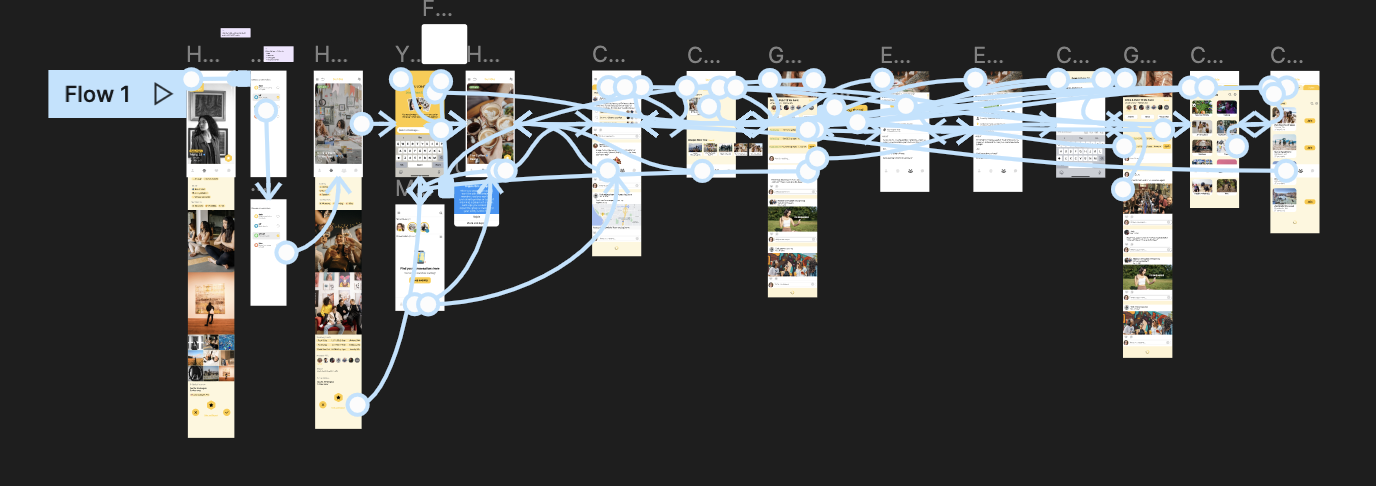
Our high-fidelity prototype focused on introducing the main user flow of the new Bumble BFF feature: joining online groups and exploring various groups’ offline events.
Test
With our interactive prototype, we conducted
5 usability tests with the following goals:
1. Determine whether users can complete tasks successfully.
2. Asses their mental state in the process, to check if the design is intuitive to understand.
3. Identify any obstacles and their severity.
…yet there were still areas to improve.
Iterating
Based on the usability test results, we went back to the prototype to change several features. Here is an example of adding prompts to facilitate the initial self-introduction to a new group. Suggested prompts reduce the cognitive load and make it easier to come up with the first message.
What else could we do?
The online friendship-making market holds vast potential as the hybrid and fully remote work model matures and looks like it’s here to stay.
Among the features we could explore, to make the connection with Bumble BFF Groups even more enjoyable and meaningful:


