Pair Anything Enterprise Portal Onboarding
Project Goal: Improving UX experience of Pair Anything Enterprise Portal Onboarding
Duration: 2.5 weeks
Participants: 4 UX designers, remote team
My contribution: Planning, heuristic evaluation, design ideation, usability testing, client demo
Tools: Airtable, Figma, Canva, Google Workspace, Slack, Zoom
Good food paired with a good drink is almost a universal safe bet to get people excited. Pair Anything is a California-based software company with a vision of offering customers a sophisticated ‘digital sommelier’ that allows for unlimited food and beverages pairing possibilities. The variety of possible matches keeps growing as the cloud-based app’s database expands.
The challenge
The work of uploading the wine catalog is being done for the clients by the Pair Anything staff.
The need to onboard the clients ‘manually’ inhibits the scaling of the app.
Pair Anything Enterprise Portal is a Content Management System where business owners can update their winery’s page and upload beverages inventory so wines can be paired with different meals and offered to their customers.
The portal has to cater to different potential users be simple enough to be accessed by the older generation wineries’ owners, yet offer advanced features to specialists who are interested in adding as much information as possible, and be scalable to include additional categories of customers - retailers, restaurant owners, sellers of other types of beverages.
Our UX team’s goal was to evaluate the current onboarding process and suggest improvements that will make it intuitive and fast. We used the design thinking process - a tried and tested UX framework that helps discover users' needs and pain points through systematic research and translate them into testable solutions.
We engaged our users in an Agile and iterative process that ensured that we were able to test and validate all of our assumptions, and quickly make modifications if needed.
Since our team members were based in different locations and time zones, we relied on an Agile principle of self-organization, and used both real-time and asynchronous communication tools, plus several cloud-based collaborative tools to share deliverables and feedback.
The process
Onboarding is the first stage of the user’s journey, an opportunity to establish trust with the potential customers. Yet, abandonment of the digital onboarding process is a widespread phenomenon, often stemming from tasks perceived as unnecessary complicated and time-consuming.
To evaluate the current onboarding process and potential onboarding issues we used a mix of methods, including:
Analytics review of the portal to gather quantitative data about users’ demographics and usage patterns.
Heuristic evaluation of the front-end app and the Enterprise Portal.
Comparative and competitive analysis.
Interviews with company’s stakeholders, existing customers and potential users.
Research
User Flow
What did they tell us
Interviews with users validated our assumption that disregarding their technical capabilities, they expect an intuitive onboarding process with clear labeling that makes them understand the product and its main functions, and a mix of resources available to assist them if help is needed.
“If the onboarding is too challenging, it’s a sign of what’s to come”
Heuristic evaluation of the onboarding process currently in place revealed that the Enterprise Portal lacks any visible instructions directing users to complete basic tasks.
Lengthy input forms do not distinguish between mandatory and optional fields. Some items are confusing, yet there are no help options available.
Furthermore, the user discovers specifications of required items deep into the process, with almost guaranteed interruption of the process to obtain the items. The delay may lead to the eventual abandonment of an independent onboarding.
Heuristic evaluation
User Journey
Persona
Based on the data synthesis and card sorting exercise to identify patterns in users’ struggles and preferences, we created our primary persona - Joana, a distribution manager for a boutique winemaker based in Sonoma, CA.
She wants to find ways to sell more inventory and use simple tools to elevate her business. Her responsibilities include piloting new products or services but she also needs a solution that can be easily adopted by anyone on her team since she often delegates tasks to her employees.
“Joana needs a thorough but approachable way to learn how to use new products, in order to feel confident in the tools she employs to elevate her business.”
Comparative and competitive analysis of the onboarding process of brands like Toast, Hubspot, Vivino, Target Wines, DoorDash and Open table revealed that they use a combination of clear interactive prompts guiding the user through the process with immediately available assistance and on-demand resources.
Design studio
Several intense rounds of sketching and the following critique allowed us to generate potential solutions addressing the main user experience struggles while dealing with the Enterprise Portal onboarding steps.
Updating information architecture
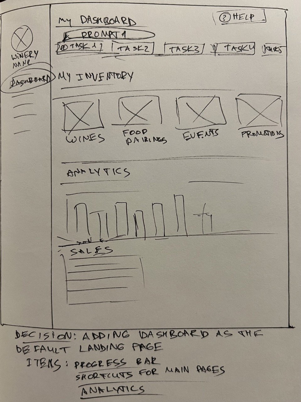
We added the main dashboard page, to replace the ‘winery details page’ as a default landing page in the CMS. The previous option served little purpose as a default destination after the input form with business details was complete, and forced the user to take additional steps through the menu to get to other pages.
Decisions
Simplifying navigation
Collapse the user menu to make the main categories easier to scan. We also kept in mind the Pair Anything team’s aspiration of scaling the portal to include additional categories of beverages, such as tea or beer, and other types of customers, such as restaurants, breweries or retailers.
Adding progress bar
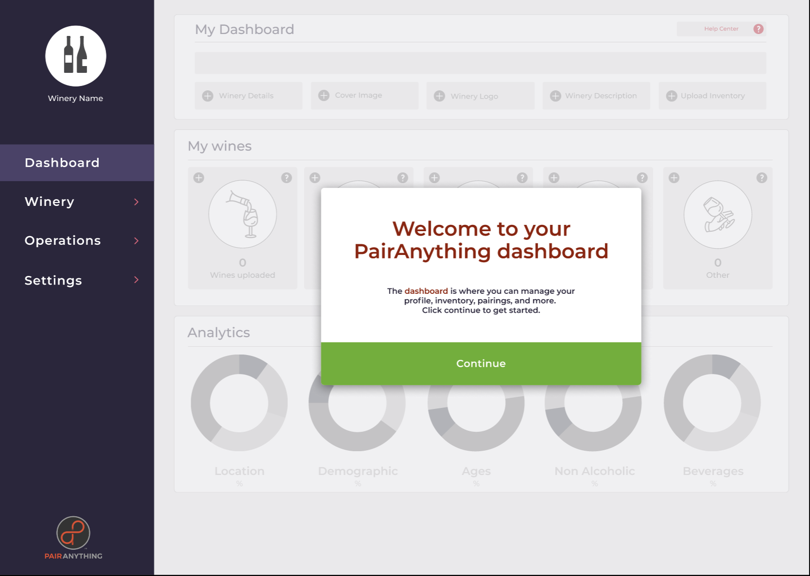
We created an actionable stepped process that the users can walk through, focusing on necessary actions. Pop-ups with clear instructions guide the user through the process.
Visible progress bar on top of the dashboard page allows for the user to easily identify where they are in the process and informs them of the steps required to complete it.
Creating Help center
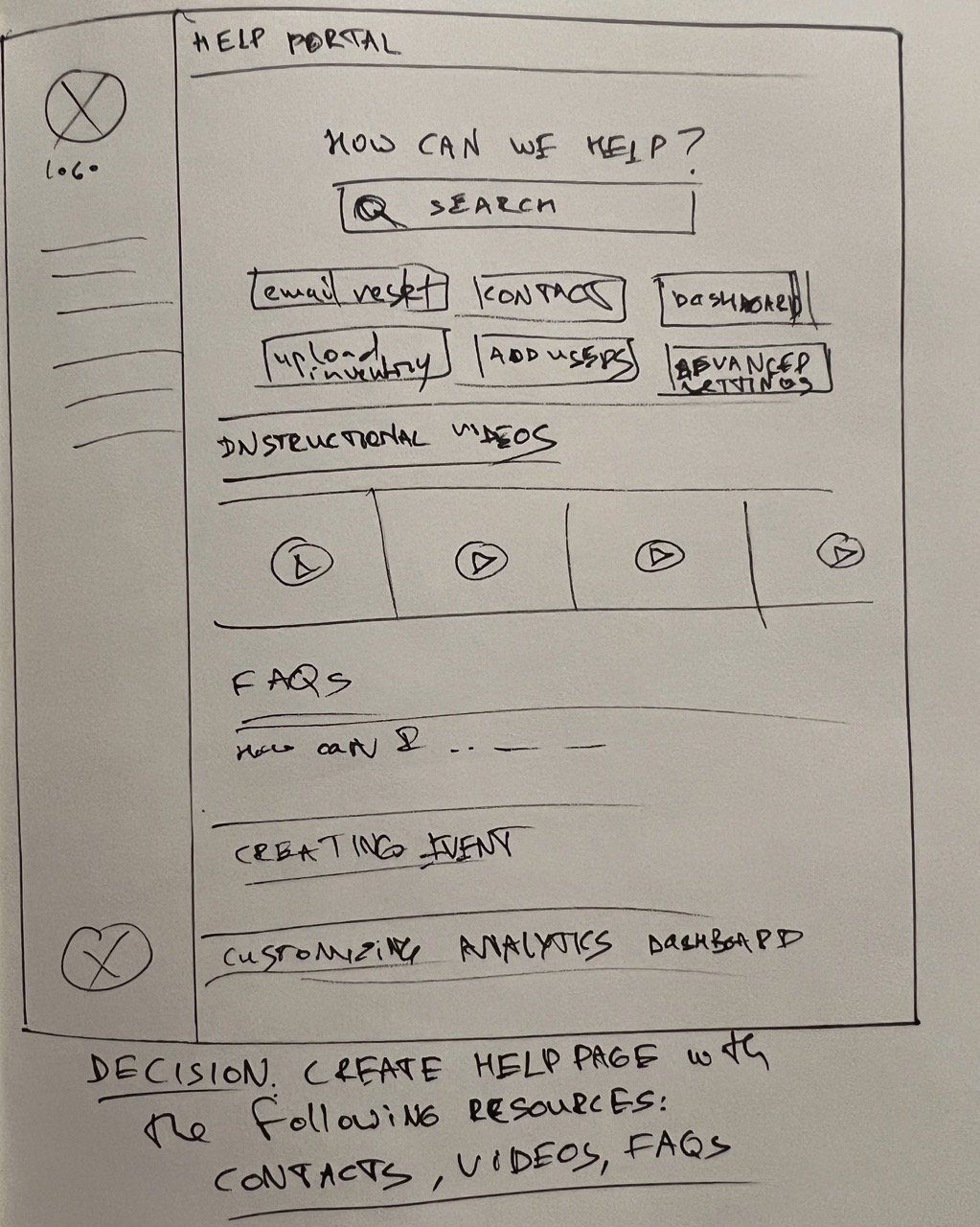
A new help page hosts a variety of on-demand resources available to the user, some of them, such as instructional videos, were created by the Pair Anything team but not organized in one place. We added to the help portal instructional videos, FAQs, and useful contacts.
In our user interviews, people had different types of onboarding experience - in person, independent, or hybrid - but the preference to have the ability to complete tasks on their own on their own terms was prevalent.
Library of placeholder images
Analysis of the existing customers’ pages at Pair Anything website indicated that they might not have the hero banner image in the right specs readily available. To avoid having a generic gray background, we suggest adding attractive images options to serve as a placeholder.
Simplifying the input forms
Simplifying the wine upload form. We split the lengthy wine upload form into several tasks, making the advanced features optional.
Justification: UX research teaches us to assume that people will get things done with the least amount of work possible. We also shouldn’t assume that people are performing tasks in a stress-free environment - and when people are under stress, they tend to make mistakes. So simplifying an interface can reduce the potential errors.
Adding placeholder text in some input form fields, to serve as prompt/clarification, remembering that this feature should be used sparingly, as it adds complications for users with visual and cognitive impairments.
Justification: Placeholder text within a form field may clarify the expected value and provide useful examples that serve as a prompt.
Usability testing
To validate our design, we conducted 5 usability tests with the current customers of Pair Anything and users that could serve as an indicator of technical capabilities and onboarding preferences of potential new audiences for the growing company.
Moderated usability testing was conducted remotely via Zoom with interactive prototype walk-through using screen-sharing software.
All of the testers approved of the general look of the portal and found it easy to understand the onboarding steps following the prompts and instructions. The progress bar helped them orient themselves in the process and stay on track.
The option to select a nice placeholder image from the library was mentioned as helpful in case users didn’t have the picture in the right format handy.
Enabling the bulk upload of the wine inventory was indicated as a highly desirable feature.
All of the testers validated the Help center as an expected feature and a natural place to seek answers or submit a ticket for troubleshooting.
There were also indications of areas in need of improvement
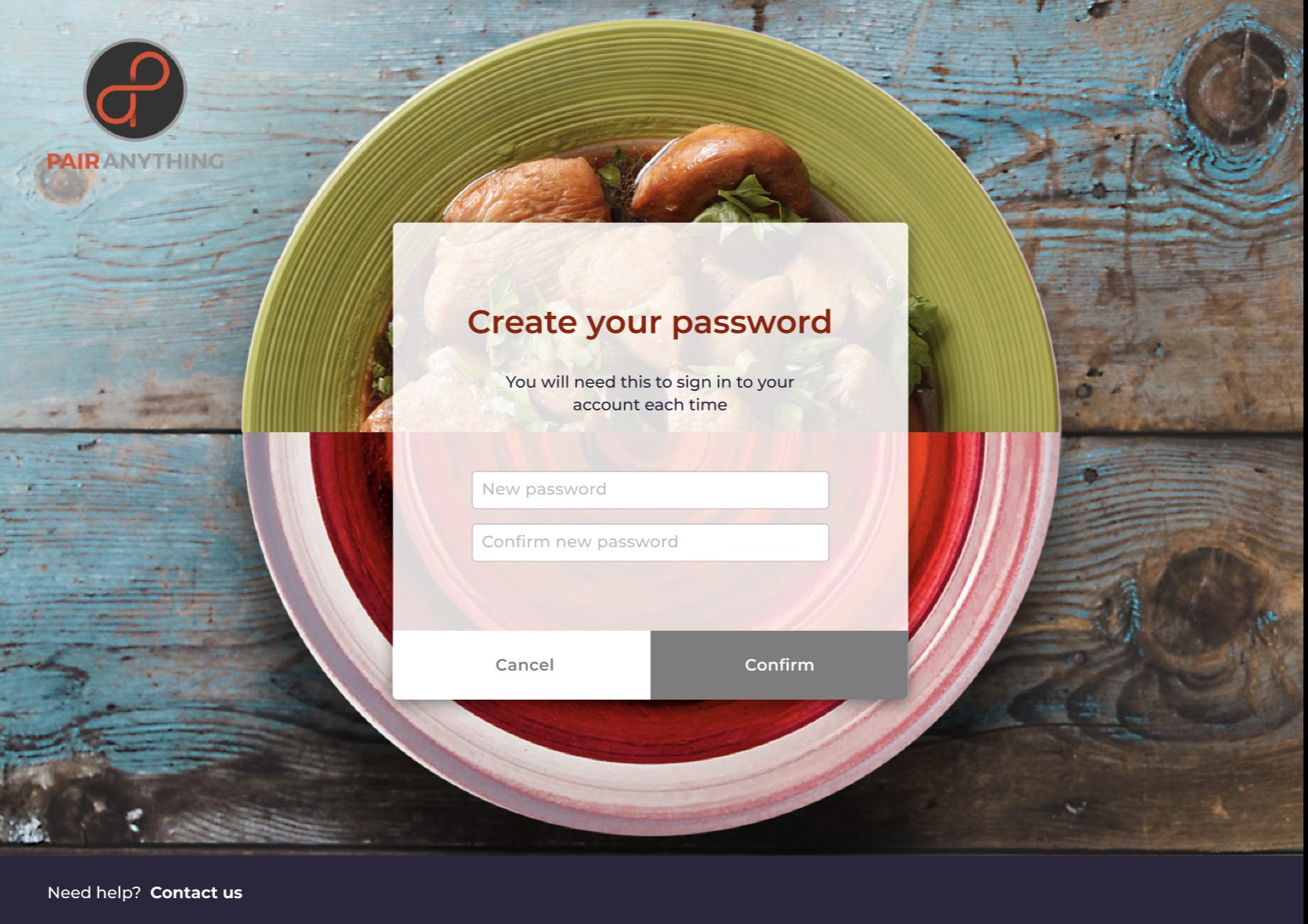
One tester thought the image on the login page should reflect the wine theme to make sure they are in the right place once they followed the confirmation email link.
Some users wanted to explore the onboarding steps in a different order - for instance, upload the wines first.
The pairing tags field in the wine details form wasn’t entirely clear to users.
One user said it would be helpful to know instructional videos are available in the Help portal before he started filling out the forms.
Iterations
Following the testers’ feedback:
We made the welcome message more prominent, graying out the background features, to emphasize the main action expected to commence the onboarding.
Removed the ‘winery message’ step from the onboarding progress bar, leaving it with the advanced features the user is encouraged to explore after completing the mandatory onboarding tasks.
In the updated prototype, the users can complete the required tasks in any order they want, keeping the ability to track the status of completion at the progress bar on top of the dashboard page.
We updated the copy in the forms to avoid potential confusion. For instance, 2 testers weren’t sure if the ‘address’ line in the winery details form meant their personal address or the winery address - so we changed it to ‘business address.’
What else could be done
Short term:
Onboarding items checklist
Add to the confirmation email a checklist of items required for onboarding.
Help portal content
Continue developing the Help portal content with clearly organized tutorials and FAQs. Consider creating live help chat. Conduct additional rounds of user interviews with the card sorting exercise to identify a structure that best fits the portal users’ expectations to guide organizing the tutorials in line with their mental models.
Preview page in the CMS
Add an option to preview the winery details page in the portal before it’s published: users could check how it looks, whether there are any typos, and what is missing, instead of the current flow of going to the website to check the page after it goes live.
Copy targeting new audience
Adding more information about the wine to target new audiences: do millennials care more about wine’s acidity or ethical sourcing? Could wine reviews from customers bolster the popularity of the product through social validation, in addition to the experts’ tasting notes?
Universal menu categories
Consider changing the main menu categories to more universal terms, to accommodate the future growth of the portal and adding more clients’ types and product categories: ‘business’ instead of ‘winery,’ ‘beverage’ instead of ‘wine,’ ‘tea’ or ‘beer.’ Conduct A/B testing to validate users’ preferences.
Long term:
Bulk inventory upload
Upgrading the bulk inventory upload & management. All users mentioned the ability to ingest the beverage metadata from spreadsheets as a highly desirable portal feature. Some also complained about the challenge of managing the wine information in several separate spreadsheets.
Offering the bulk upload of the catalog using CSV files could be a big time saver during the initial inventory upload.
API integration
Even more efficient inventory management would include API integration with the customers’ primary website which could prevent the need to keep in sync two separate online databases.
Cloud-based inventory
Offering a cloud-based solution coupled with educational content on effective management of wine inventory within the Enterprise portal could strengthen Pair Anything’s position as a Digital transformation leader in the wine industry.


